
Last month I finished a small job for a friend. Yichen Ren spent nineteen years in banking before starting his own mortgage broking business, LendPath Finance, and by the time he asked me for help he had already made his logo and a one-page website with AI. His draft already worked. AI had handled the structure, and what was left for me was the surface, the look and feel that people judge first. More and more business owners can now get this far on their own, and I think that changes where a designer comes in.
I could tell within half a second of landing on his draft that AI had designed it, from the typography, the colour and the layout. When AI builds a site for someone who isn’t a designer, the result tends to be generic, with little feeling or human touch. A website designed by a person can be really bad too, but it’s bad in a different way. However bad it is, it still carries some feeling, because someone wanted to show something and made decisions behind it, even when those decisions weren’t necessarily good ones. AI can make beautiful, impactful websites. What decides the result is the person in the seat, prompting and directing it.
From a business point of view, the draft wasn’t doing its job yet. Most of Yichen’s clients come through referrals, so the people who visit his site have usually heard of him and want to check him out. For a broker who has just started on his own, the last thing he wants is people landing on his site and not trusting him. The website is his front door, and that judgement happens fast. People decide how appealing a web page looks within about 50 milliseconds (Lindgaard and colleagues, 2006). In a Stanford study of more than 2,500 people, the look of the design was what people mentioned most when judging whether a site was credible (Fogg and colleagues, 2003). His draft didn’t create that first impression, or the emotional connection that goes with it.
He never told me any of this. I worked out what the site needed and talked it through with him. A broker needs credibility first, so that people see a professional who knows finance well and is at the top of his game. He also needs a personal connection, which means his personality has to come through. And there should be a visual story, so someone arriving already feels their finances will get better, a north star they can feel.
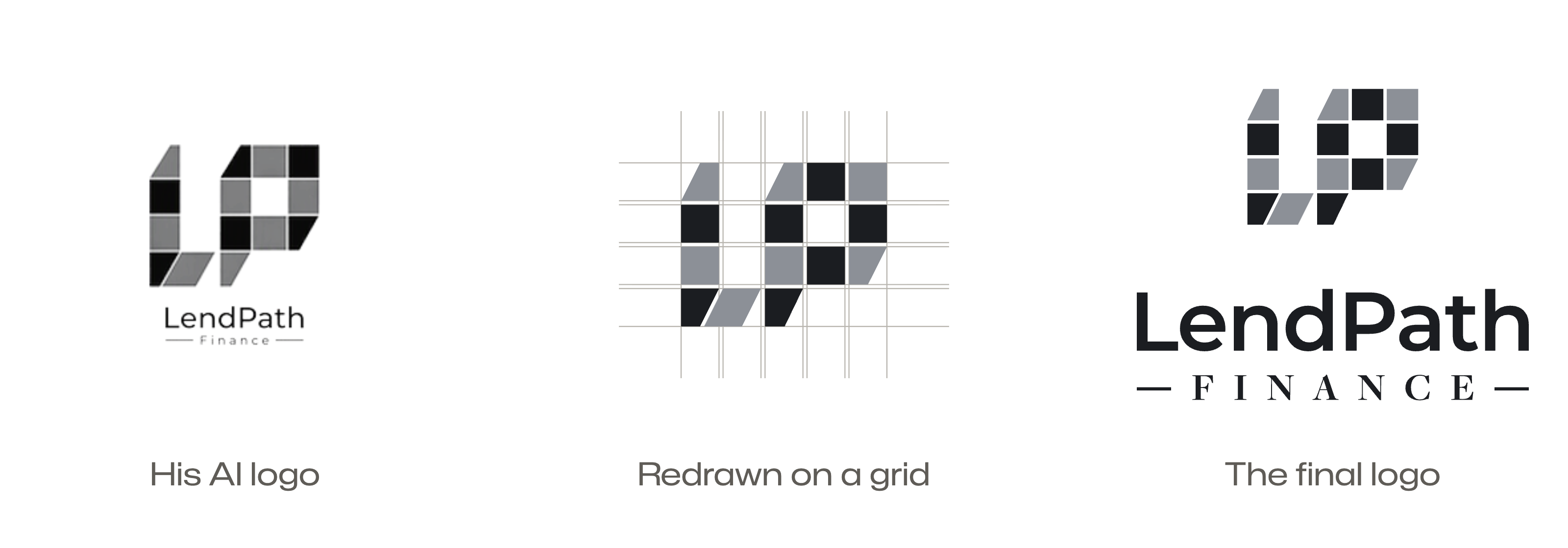
I redrew his logo on a grid so it’s more proportional, intentional and precise. I had to redraw it anyway, because his AI version only existed as a low-resolution image.
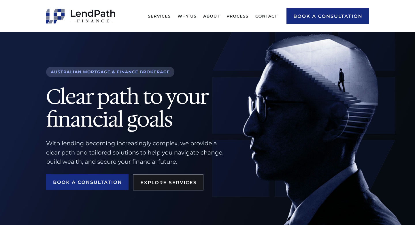
My first direction for the top of the page went further. I put a staircase inside a silhouette of Yichen’s profile, with a small figure climbing toward the light, a path up to financial success. Every part of that image was made with AI from my direction.
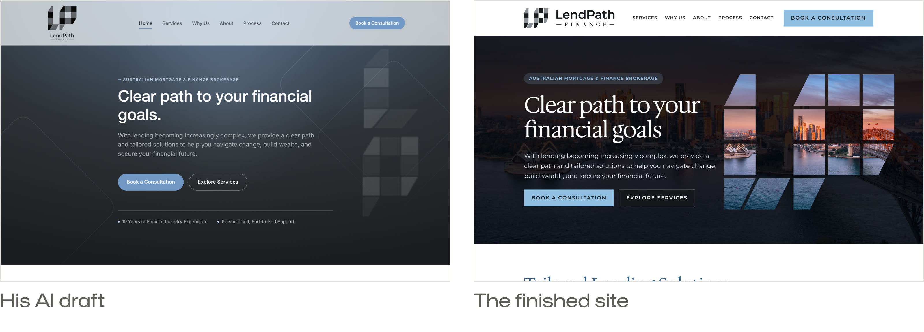
Yichen preferred to keep to one photo of himself, and he asked for a landscape instead. His one design request from the start had been a big watermark of his logo at the top of the page. Finance is usually about the city and its buildings, so I put Sydney inside his logo. It tells a story through his company. His logo is almost like a window, and through it people can see wealth and financial success within reach.
The colour was his own choice, a subtle, desaturated light blue that’s low-key but professional, down to earth and not flashy. The photo of him was his choice too. I lifted what he chose with the type, a clearer visual hierarchy and the images, so the look and feel speaks for his personality. All the copy was his as well, including the jargon line: “LVR, ICR, DTI, NMS, HEM, serviceability tests… confused yet? You don’t need to be.”
Underneath, the structure stayed close to what he had. His draft arrived as a finished mockup with the layout in place, so my first job was to check whether the structure made sense, and it was pretty decent. Where I did change copy or structure, I asked AI for better alternatives. I used AI heavily for my part. It made the images, and I did most of the layout and colour changes by prompting rather than moving things by hand, which made me dramatically faster. Knowing what to ask and how to judge what comes back still takes a designer’s expertise. The last refinements I made by hand, changing colours, font sizes and spacing, and that’s where taste comes in.
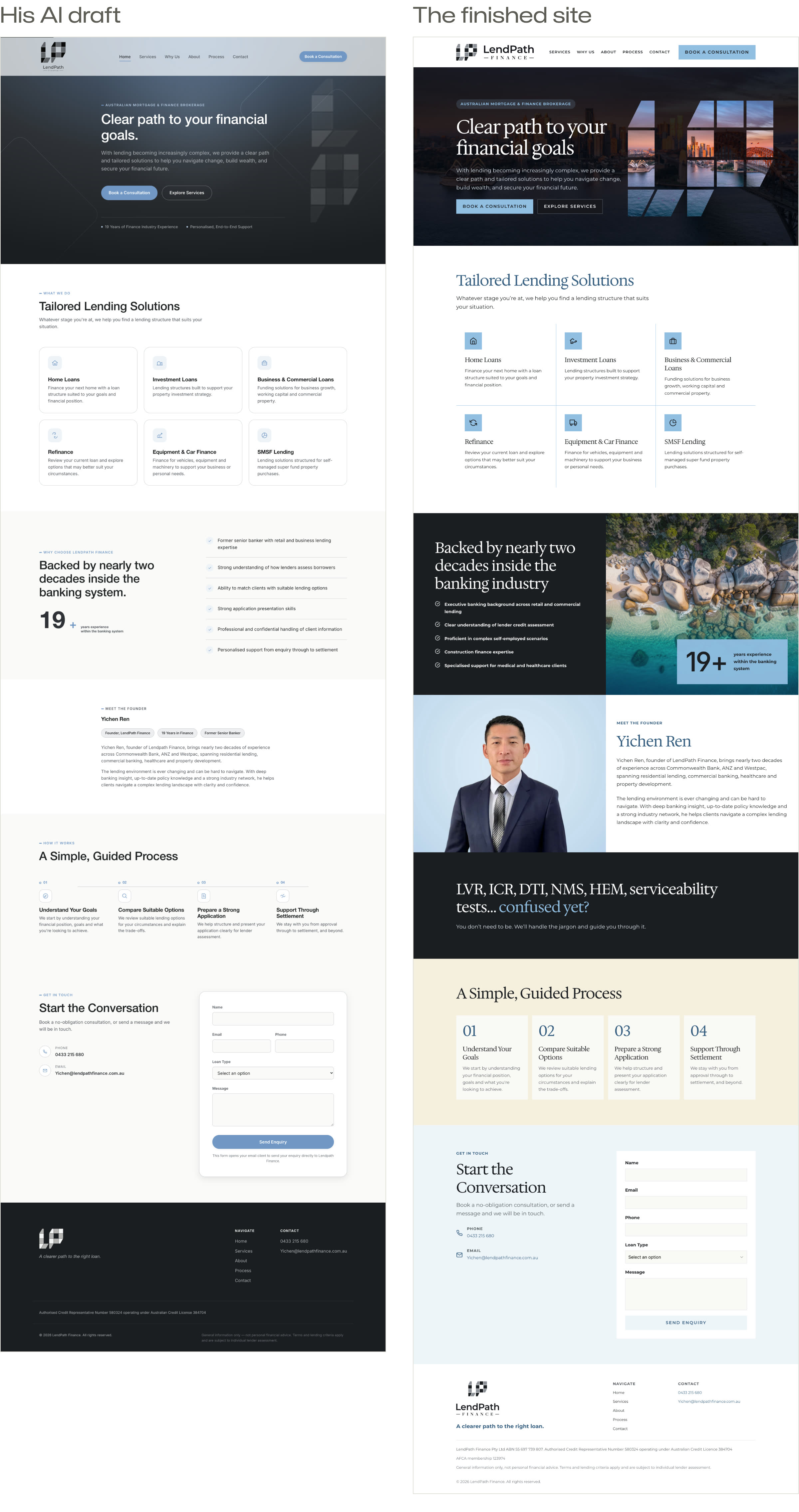
I’d encourage any small business to push AI as far as it will go, the way Yichen did. He arrived with a logo, colours, a content structure, a wireframe and copy, so it was as if a junior designer had already done most of the job and I came in for the final touch. From scratch, I would have designed the brand first, with logo options, colour palettes, a visual direction and mood boards, then agreed the content and copy structure and locked down wireframes before any visual design. That takes weeks. His job took days, and it cost him about a third of what starting from nothing would have.
When every business does the same, though, the advantage gets smaller, and you still need someone with taste and judgement to make you stand out among all the AI-made sites. So it’s worth knowing when to bring in a designer, and then spending where it counts, on the final touch. A good sign it’s time is when your site has to earn the trust of people checking you out, and it still looks like every other site made with AI. When Yichen decided to hire me, he put it more simply. Professional work, he said, should be left to professionals.
There’s also the technical side. Even when business owners can design a website with AI, not all of them know how to, or want to, deal with hosting, connecting the domain and the enquiry form, the favicon and basic SEO. Most would rather an expert set it up properly, and that’s part of the value too.
For designers, this job was a small, real example of the split I described in my last piece, Where the designer sits when the visitor is an agent. There I argued that agents will increasingly design the middle planes of user experience, the logical work of what a site contains and how it’s structured, while strategy and surface still need human judgement. That piece was about agents visiting websites, and Yichen’s visitors are still people, but the split held here too.
A surface-only brief still doesn’t mean working only at the surface. You have to understand every layer underneath, especially the strategy, because everything below holds the surface up. On a one-page site like Yichen’s, the strategy is fairly easy to read. For a business with many audiences and segments, defining it is never easy, and a designer who doesn’t understand what they’re designing for can’t design a surface that helps the business get where it wants to go.
If you’ve built your own site with AI, I’d love to see how it turned out. And thanks to Yichen for letting me share his before and after. His site is live at lendpathfinance.com.au.

